FCQ REDESIGN
INFORMATION VISUALIZATION
This project focused on enhancing the usability and interactivity of CU Boulder's Faculty Course Questionnaire (FCQ) dashboard. Our goal was to provide students with a more dynamic tool for course selection by integrating grade distributions with FCQ scores.
Through data cleaning, visualization, and prototyping in Altair, we developed an interactive dashboard allowing students to compare courses. I applied advanced data analysis and user-centered design principles to improve the dashboard's expressiveness, making it more aligned with student needs for making informed enrollment decisions.
FCQ DASHBOARD REDESIGN PROJECT
When we started this project we knew we wanted to focus on an issue that directly affects our lives as students at the University of Colorado. As we began brainstorming topics, we were in the process of registering for classes and began to express our frustrations with the enrollment process. When selecting what classes to take, students have the option to review instructor and course FCQs in the class search portal, but the visualizations used to present these responses are not particularly useful to students. As students ourselves, we recognized that in addition to course and professor FCQs, we would also benefit from an exploration into the average grades given by professors who teach the courses we want to take.
By taking a more dynamic approach to the FCQ dashboard, we hoped to increase the effectiveness and expressiveness of the current FCQ visualization.
What’s SO BAD ABOUT THE CURRENT DASH?
Before we could make any improvements to the dashboard, we needed to understand what was not working with the current version.
We did so by analyzing the existing dashboard in terms of design principles and expressiveness.
We used two datasets that are available for public use from CU; the FCQ data from 2020-present and the average-grade data set from 2006-present. Before 2020, the faculty and course questionnaire asked questions that differed from the current set of questions, so we decided to default to using the most recent version. This limited our data set to only include data on courses taught between the years 2020–2023 but ultimately makes the data shown more relevant to students.
A significant part of our process was dealing with cleaning and merging our data sets which is detailed visually in the annotated image below.
LAYOUT
At this point in the design process, we had identified that we wanted to make a dashboard with various visualizations connected via a common source of interactivity instead of multiple individual visualizations. A large part of this decision had to do with remaining true to the needs of the user, CU students. One of our readings states, “Interaction enables people to adjust a visualization to their own needs and ask it different questions” (Baur). We quickly realized that if this design were to replace or supplement the current FCQ dashboard, all visualizations needed to be linked to afford robust exploration.
This part of our design process was centered around defining a strong and consistent theme within our data and subsequent design choices.
With our finalized design goals in mind, we began to prototype in Altair.
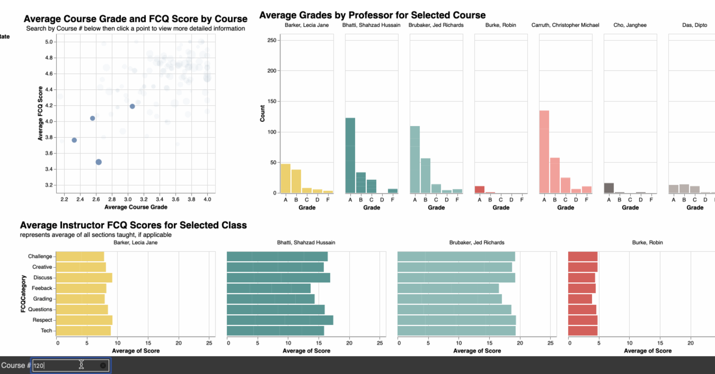
We experienced a lot of growing pains while developing our dashboard. During the lengthy data cleaning phase we experimented with several types of visualizations as our data was cleaned. From the beginning, we knew we wanted to emphasize interactivity, and we began experimenting with a bar chart that repopulates its values based on a selection made in a primary scatter plot. The bar chart we were attempting to make was correlated to the received grades breakdown for the selected unique course.
Brainstorming
We started this project with the intention of revamping an existing visualization, so we focused our sketches and brainstorming on exploring compelling intersections in our dataset. As you can see in this collection of a few sketches and our earliest visualizations, we were comparing enrollment and class size, average grades, and FCQ responses as our main points of analysis.
In our initial brainstorming and prototyping phases, we tried to stray away from the current design of the FCQ dashboard, in order to allow ourselves to explore interesting intersections in the data. As you can see in this collection of a few sketches and our earliest visualizations, we were comparing enrollment and class size, average grades, and FCQ responses as our main points of analysis.
LAYOUT
At this point in the design process, we had identified that we wanted to make a dashboard with various visualizations connected via a common source of interactivity instead of multiple individual visualizations. A large part of this decision had to do with remaining true to the needs of the user, CU students. One of our readings states, “Interaction enables people to adjust a visualization to their own needs and ask it different questions” (Baur). We quickly realized that if this design were to replace or supplement the current FCQ dashboard, all visualizations needed to be linked to afford robust exploration.
This part of our design process was centered around defining a strong and consistent theme within our data and subsequent design choices.
Read more about the specifics of the design and user experience interviews in the Offical project write-up!
An important part of every student’s enrollment decisions revolves around their ability to get a good grade in the classes they enroll in. With access to both FCQ and average grades data from CU, we knew we wanted to incorporate grades into our revamped dashboard. This begs the question,
“How can we most effectively and expressively create an interactive dashboard that meets the needs of students?”
For the scope of this project, we focused on answering this question with INFO classes, but our design could be applied across departments or even the entire university.
Most students already know what courses they plan to take, but what if a course has multiple professors? Students might wonder, “Who should I take this course with?” The current FCQ visualization does not afford the ability to draw these comparisons in a singular visual field.
This limitation of the current FCQ dashboard sparked our curiosity to examine the relationship between average grades for a course and average FCQ scores and motivated us to create an interactive dashboard that allows students to select a specific course and be provided with data such as grade and FCQ distributions between professors who have taught the course, ultimately making the dashboard more attune to the needs of its users.
Although the current FCQ dashboard does a decent job of adhering to design principles, it is not visualizing the data that we know students want and need to interact with to make the most informed course scheduling decisions. A major issue within the visualization’s expressiveness was that the FCQ dashboard only displays the data for a specific course and instructor, and does not allow users to compare between instructors directly. Regarding expressiveness, the current FCQ visualization does not meet the needs of its target audience.


