WEBSITE DESIGN
DIGITAL LEGACY CLINIC
The Digital Legacy Clinic is an innovative non-profit initiative launched by University of Colorado Boulder (CU) students to tackle end of life planning for accounts and data. It’s also the class where I and my 2 website teammates got to design an entire website in six weeks.
The clinic team provides help desk-style support for users seeking answers on how to manage the accounts and data of a loved one after they have passed, as well as to create longer-term strategies for those looking to get their digital estates in order.
1 ) DEFINE OUR NEEDS
The Digital Legacy Clinic website is where clients first meet the clinic and its mission. It serves as both the clinic's public face and the main mode of initiating contact, providing a clear path for clients to access support.
As a CU site, it needed to both fit into the existing design standards that CU mandates, and be built within webexpress - the university's chosen CMS.
3 ) EVALUATE: CU designs
We then explored existing CU sites to debate the strengths and weaknesses of their designs. What did we want to copy, and what didn’t serve our mission?
We analyzed elements like layouts, navigation, and content balance, noting what worked and what didn’t. While we admired features like the ‘timeline piece’ for its visual storytelling potential, we found many designs felt clunky, dark, and overcrowded with text.
The biggest takeaway was the importance of simplicity—fewer words, more intuitive icons, and a cleaner use of space to create an inviting and user-friendly experience.
2 ) Ideation: SITE MAPPING
At the very beginning, the clinic was still in only just preparing for the pilot launch. We had nearly just finalized the decision to use a ticket-based system for client support. Website team began sketching ideas in the biggest general steps to determine what our site needed to look like, and discussed at large what it should communicate - an FAQ? Media and Press pages? A forum page to open a help ticket?
Over the course of a few meetings with smaller teams like the content group, we outlined the site’s most essential features in these sketches.
6 ) Prepare for launch!!
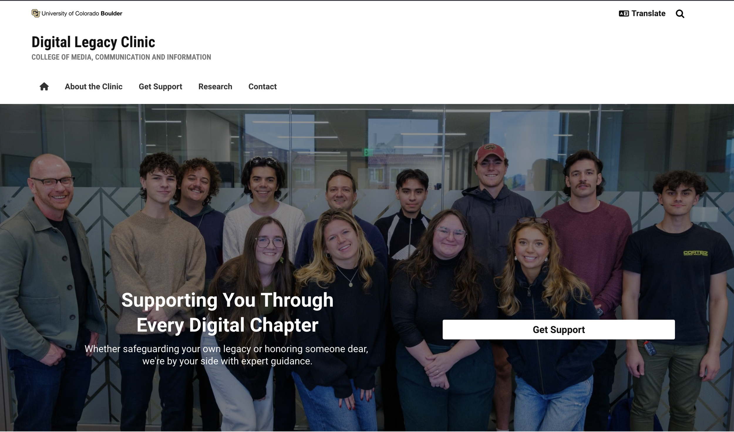
The homepage’s evolution captures the iterative nature of this design process—from initial drafts to a streamlined, functional final product. Each stage reflects the webteam’s growing clarity about the clinic’s goals and audience needs, as well as our efforts to balance content with CU Boulder’s design standards—and basic design. We focused on creating a clean, user-friendly layout that emphasized simplicity, accessibility, and clear calls to action.
Throughout this process, continuous feedback and testing helped refine navigation, content placement, and visual hierarchy, ensuring the site was both polished and practical for launch.
4 ) MiD-FI PROTOTYPING
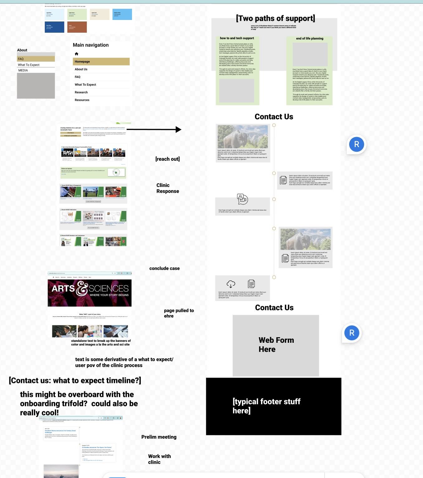
Using Figma, we developed initial prototypes to flesh out the site’s content and structure, drawing inspiration from successful elements in existing CU designs, such as column layouts, banners, and clear page divisions
Figma served as a flexible, intuitive tool for rapid design iteration—something WebExpress couldn’t easily accommodate at this stage, as it was both super unfamiliar to all of us, and VERY VERY clunky. Figma helped us move quickly and communicate our ideas clearly, in a higher fidelity than a simple sketch. In building these mid-fi prototypes, we had created a plan that made it easy to delegate tasks and split up to work while being sure we still would follow a consistent design between the two of us.
7 ) FUTURE PLANS
We delivered a thoughtfully designed website that pushed the boundaries of CU’s design system, infusing the clinic’s digital presence with warmth and personality that suits our vibes.
By incorporating media day photos and leveraging white space effectively—one of my biggest hurdles throughout the process—we created a welcoming and user-friendly site that reflects the clinic’s mission and services without overwhelming visitors.
However, the work isn’t done. Early client tickets have revealed some confusion about the clinic’s scope, signaling opportunities for future improvements. Key wishlist items include: clarifying what services we don’t provide, softly emphasizing that the clinic does not operate from a physical location, and addressing common questions through a dedicated FAQ page.
5 ) CHALLENGES
In building this website, we realized that in some ways we were tasked with designing and communicating what the clinic was before we the clinic team had even made our final call on the matter.
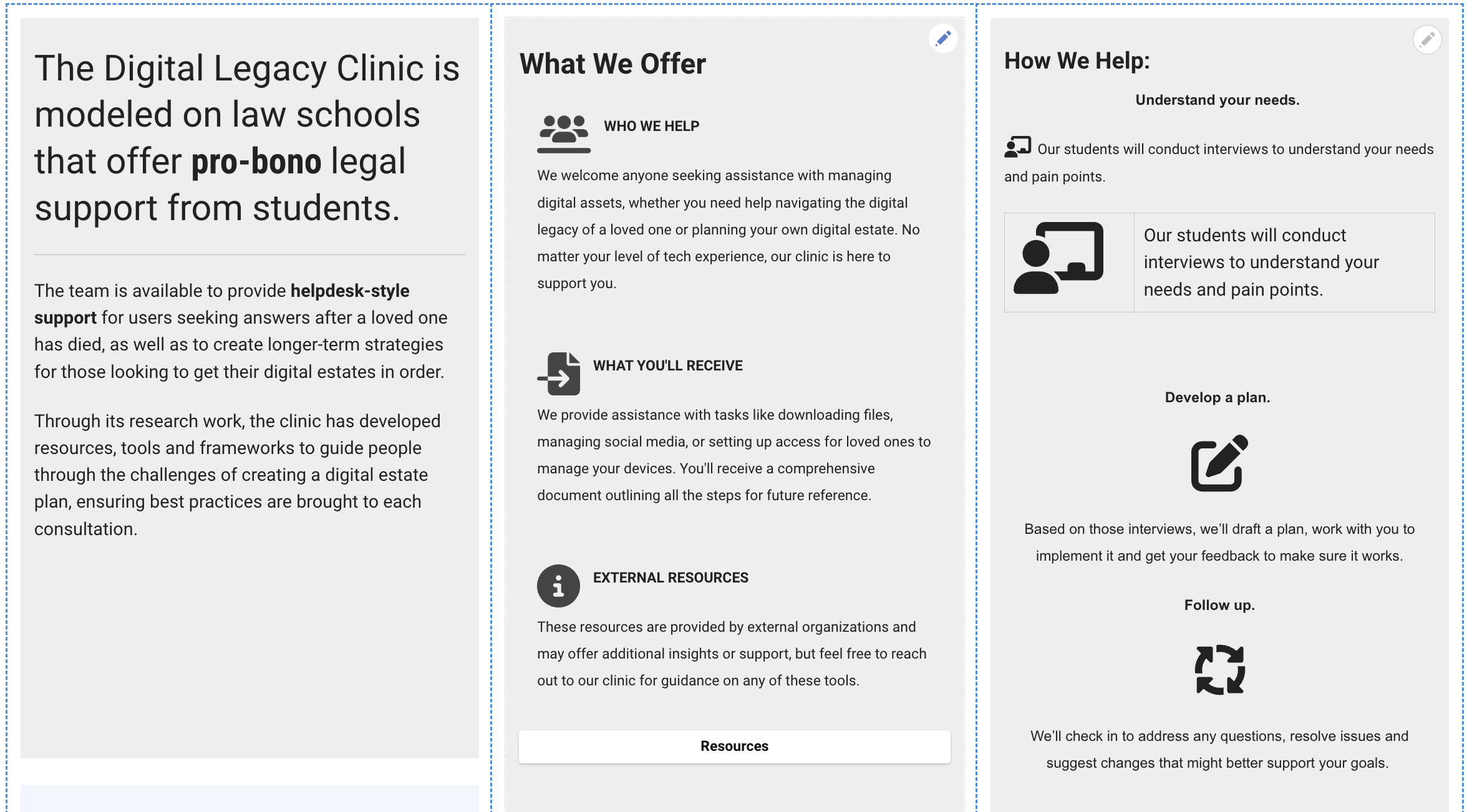
We depended on existing resources to define what exactly we should be trying to communicate on the website. A key resource was an early trifold flyer designed by Dr. Brubaker, which outlined the clinic’s goals and ways to get involved. We aimed to incorporate both its content and visual elements into the website, ensuring continuity across materials.
This process required close collaboration with the content team to refine copy that effectively captured the clinic’s purpose.


