TEXT MINING - DATA
AI ART - ART
MOD 2 - LDA
This is the third section of the Mod 2 assignment for analyzing the labelled text data I collected from news articles and subreddits on AI art and art. In this section, I explored latent themes (topics) in my text data using Latent Dirichlet Allocation. LDA uses probabalistic models to see which words are most associated with each topic.
DATA FORMATS
The idea is to see which words frequently occur together and from there infer the underlying topics, which can then provide insights into the content of the conversations happening in my text data. In order to do this, the data needs to again be converted into integers - a document term matrix. Using count vectorizer, I combined my datasets and fed it into the model.
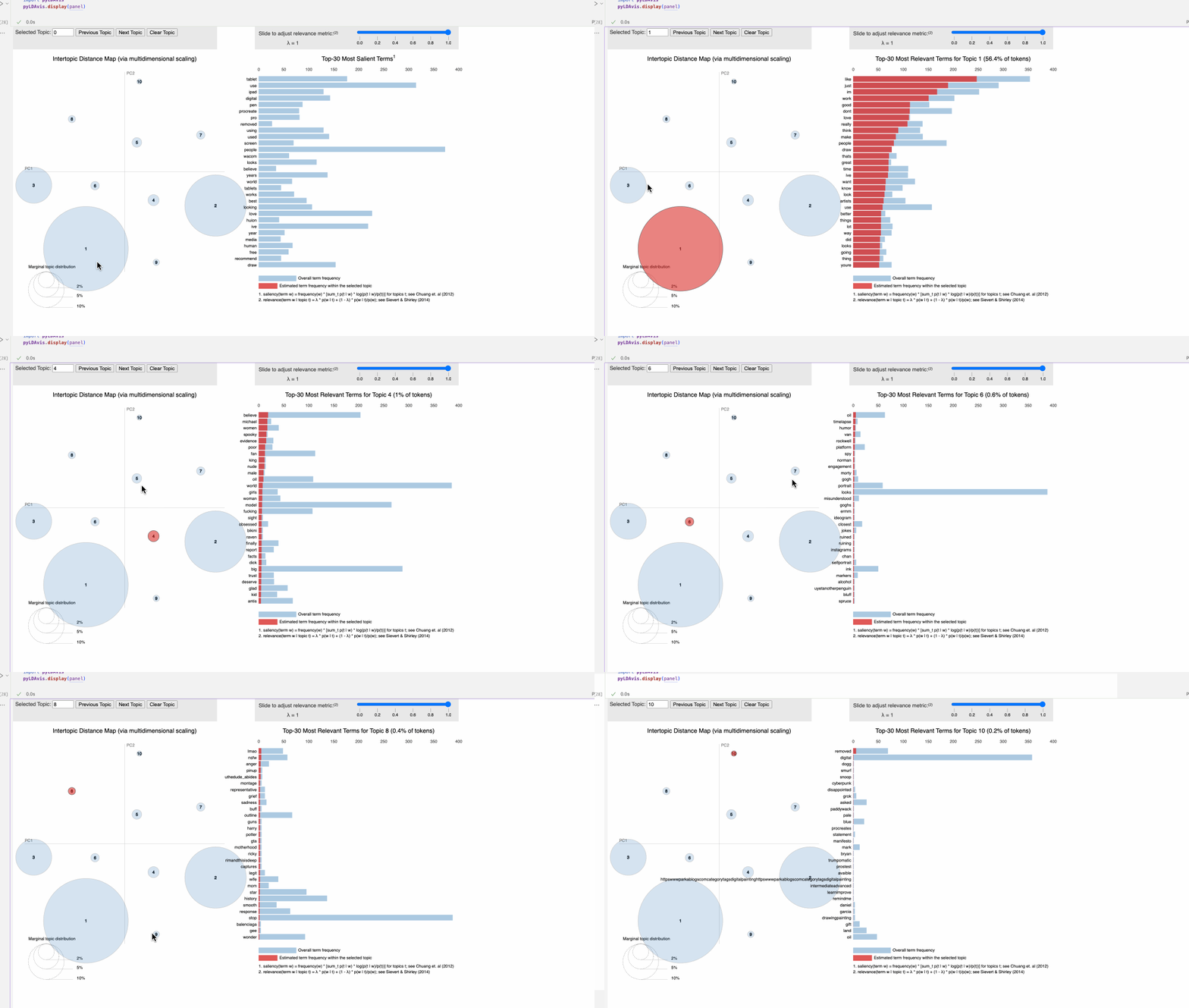
This is an interactive LDA visualization - A two-dimensional plot where each bubble represents the topic. The size of the bubble indicates the prevalence of that topic, and distance between the bubbles reflects the similarity or difference between topics. The bars here are across the whole corpus, rather than the sample as above, but the idea is the same.
A few of the topics are quite basic collections of words- they’re the ones that had the higher counts and became my ‘outliers’ - general stuff about posting, liking, and stop words make up topic 3, and topic 7 seems to cetner on art devices and brands - ipads, procreate, graphic tablet brands like wacom, huion, and so forth. Topic 6 seems to point to more.. basic keywords, and the ‘upstream’ item makes me think it centers on more ai-prompting discussions. Topic 4 mentions snoop dog, grok, a manifesto, and ‘trumpomatic’, which I know from earlier EDA comes from the AI art subreddits. All in all, of the various analysis I’ve done for mod 2, topic modeling feels the most intuitive and illustrative of the data!
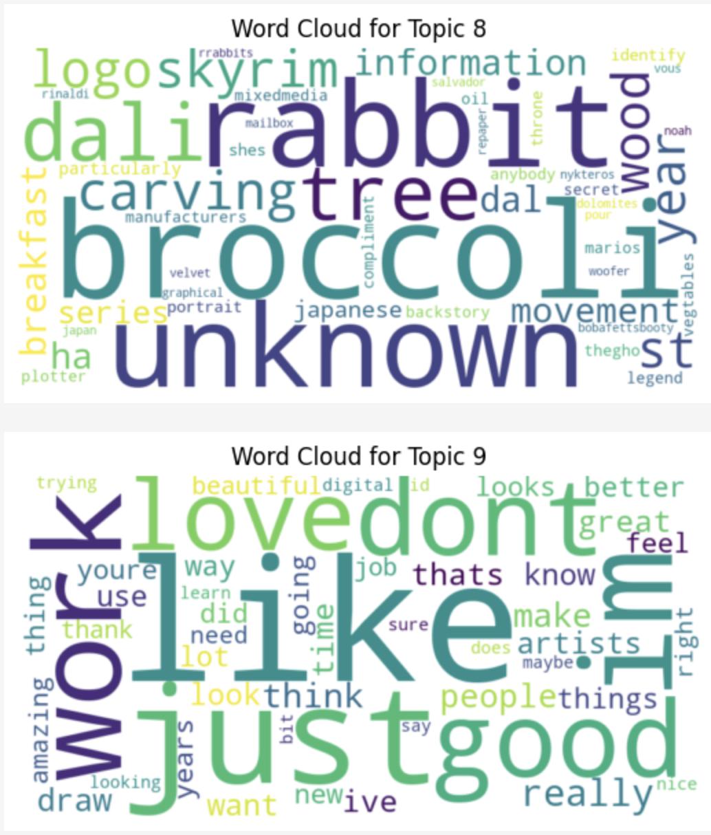
Rather than read them all from those charts, wordclouds make it easier to get a sense of each topic. They get progressively more nonsensical as they go up, as I made many more topics than truly fits the data- the most incomprehensible one being 8, in my opinion. Some topics that “make no sense” can be traced back to people describing the subjects of a specific art piece, presumably one with rabbits and broccoli. NSFW art is also a recurring discussion in AI art spaces, which manifested in topic 2.
These charts are two collections of the topics, represented by how often each individal term appears. You’ll notice I chopped them into groups - make note of the differing Y axes. They’re standardized, however, topics 3, 7 and 9 were at such a different scale that they’re visualized on their own, as pseudo outliers. To the right is a small screenshot of what it looked like when visualized all together before I fixed that scaling issue!
Consistent with the other explorations and analysis, some topics are dominated with a bit more technical AI terms than others. Others focus on famous artists, painting, mediums, and so forth. Some topics collect notes on basic phrases and conversation topics within the niche of art - people, artists, looking, like, and so on. As the topics get smaller - honestly, this many is not quite necessary - they become a bit less relevant and more messy, as communicated by their small bubbles on the chart.


